

Overview
This is a 3-week pro bono website redesign for our client, Symplicured. It is a healthcare startup which aims to provide users with a symptom checker that generates the most probable diagnoses based on validated medical questionnaires.
Project Goal: To provide users with a simple and direct way of searching their symptoms, and equip them with knowledge about their diagnoses (causes, treatments and prevention) so that they can confidently manage their symptoms using this website.
Timeline
3 weeks (Apr 2021)
Methods
User Interviews, Affinity Mapping, Heuristic Analysis, Wireframes, Prototyping, Usability Testing
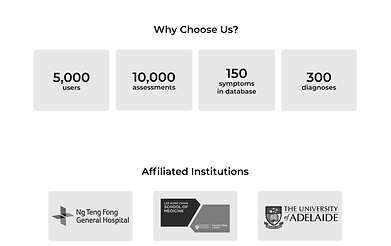
Client
Tools
Figma, Miro, Adobe Illustrator, Google Sheets
My Role
UI/UX Designer
Team Members
Christopher Lee- Project Manager
Fiona Chua- UX Researcher
Ding Hui Wen- Lead UI Designer

"71% of internet users search for health-related information online."
Source: Health Information and CAM Online Search, 2020

1. Understanding the Problem
User Interviews
13 users were interviewed to give us a better perspective on users' pain points and search behaviours with regards to finding health information online.
Some key insights from the interviews included:
Users need actionable next steps after getting their diagnosis so that they are well informed on how to manage their condition

Users are confused by medical jargon and end up spending additional time researching further on what the term(s) mean

Users are frustrated when they are unable to accurately identify and communicate the specific location (body part) of discomfort

Users expect to get a range of plausible diagnoses so that they are informed of all possibilities

Users evaluate the credibility of a health- related website based on whether its affiliations and sources of information are authorities in the field
As-Is Website Evaluation
We embarked on the phase of website evaluation which involved heuristic analysis and collecting user feedback with the aim of improving overall user experience.

Home page
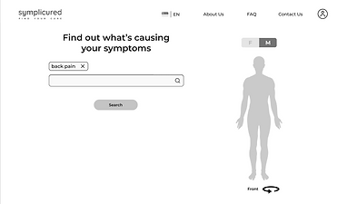
Users want a more comprehensive list of symptoms and prefer to search free-text rather than having to select a symptom from the drop-down menu.
"The fact that I am unable to find my symptom within the drop down menu gives me the impression that the website is lacking."
Heuristic Analysis (Consistency and Standards)
Menu hidden in hamburger icon (commonly used on mobile)
Recommendation: Instead of the hamburger icon, we suggest making the global navigation bar clearly visible throughout the website so that the it does not deviate from platform and industry convention that users are familiar with.


Medical Questionnaire
Users dislike questions that were repetitive and generic, hence questions should be tailored, eliminating unnecessary questions and allowing a more personalised experience for the users.
"Didn't I just answered I was 40-50 years old? Why am I being asked if I'm above 60 years of age again?"
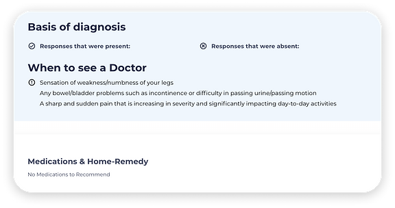

Results Page
Users want diagnosis to be explained in layperson terms. They also highlighted that actionable next steps are lacking and have no idea how to make use of the information on the results page.
There's the big issue of 'what's next'? So what happens after this? There isn't that much information, you need a lot more information here."
"Yes, the results dashboard provides users with information on causes but did not give us a cure, how we can do self-treatment. I want to be able to click on Recommendation and more information is provided."
Heuristic Analysis (Match between system and the real world)
Design should speak the users’ language
Recommendation: Refrain from using medical jargon (Scientific name of diagnosis) and vague terms (‘Basis of diagnosis’ and ‘Strong evidence’) should be explained using words and concepts familiar to users.
Competitive Analysis
Analysis was conducted on 8 international and regional competitors in the same industry to gain strategic insights on their strengths and best practices.


Main Learning Points
All competitors allow users to type in their desired search terms and some even offer predictive phrases based on what users have entered.
Most competitors generate > 1 possible diagnosis.
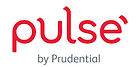
Regional competitors (Pulse by Prudential and Ubie) provide medical information localised to Asia's context.
2. Narrowing the Scope
Meet our Personas
With the insights gathered from user interviews, we created 2 personas to guide our decisions and priorities during the design process. Hover to view their user journey maps.

Acute Andrew
Financial Advisor
32 year old

• To know a few possible diagnoses and how symptoms match against them
• Validation that others are experiencing the same symptoms and there is nothing to worry about
NEEDS
• To find out if injury is serious and requires a doctor's consultation or he can self-medicate and recover fully within a short period of time
GOALS
BEHAVIOURS
PAIN PONTS
• Busy and always on the go
• Searches on mobile
• Sporty
• Visual learner
• Unable to accurately communicate specific anatomical term (body part)
• When search process is engthy
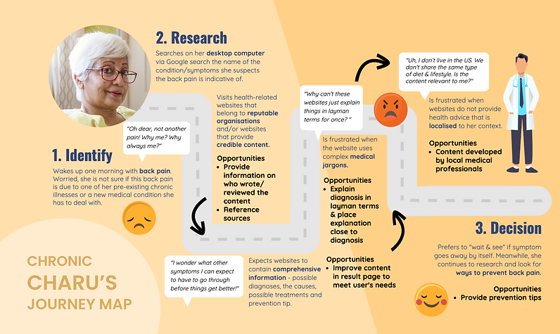
Chronic Charu
Retiree
53 year old

• Informative websites which provide comprehensive information on treatment and prevention tips
• To know that the information she is consuming is from reliable sources
NEEDS
• To research how she can change her lifestyle to manage the symptoms and multiple chronic illnesses that she is suffering from
GOALS
BEHAVIOURS
PAIN PONTS
• Health anxious
• Maintains an active lifestyle
• Researches on her condition online
• Uses desktop because of bigger screen
• Health advice is not localised to her context
• Complex medical jargon that are difficult to understand
Problem Statement
Users need a reliable health symptom search engine, that provides them with a clear and direct way of describing and understanding their symptoms. They want to determine possible diagnoses, causes and treatments that are localised to their context, in order to confidently manage their symptoms.
Areas of Focus
Based on the research insights, we identified 8 users' issues to work on for the redesign.
1. Credibility of Website
Show that info sources are medically reviewed
Highlight website's track record (stats & figures)
2. Complex Jargon
Use layman terms
Provide explanation when necessary
3. Communicate Area of Discomfort
Use of body map
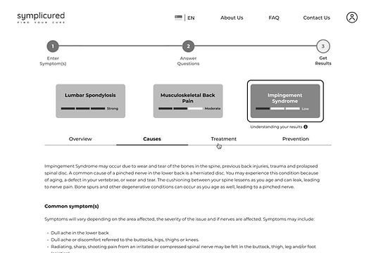
4. Information Organisation
Nested questionnaire
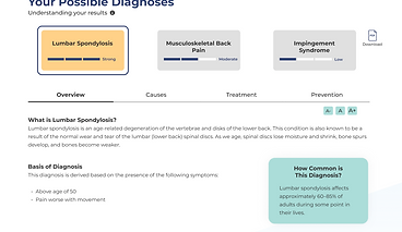
Reorganise info on results page using tabs
5. Range of Plausible Diagnoses
Provide 3 possible diagnoses and explain match strengths
6. Localised Health Advice
Videos with localised content
Highlight medical team's experience in Asia
7. Severity of Condition
'How common is this diagnosis' section
8. Actionable Next Steps
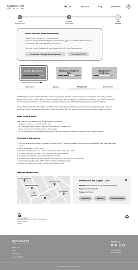
Tips on 'Prevention'
'Find your nearest clinic' (map with address and contact info)
With the scope defined, we carried out a design studio with our client. Together with him, we spent the afternoon bouncing ideas off one another and ideated UX solutions to resolve issues faced by users.
Here are some of our sketches from the design studio...

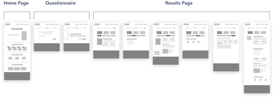
3. Wireframing the Solution
We then converged our best ideas and did quick low fidelity wireframes for each of the pages (Home Page, Questionnaire, Results Page).
.png)
Home Page

Questionnaire

Results Page
.png)
.png)
4. Testing out the Design
To evaluate our design and identify usability issues, we conducted 2 rounds of usability testing with 10 participants. During these sessions, we observed how participants navigated through the website to learn more about their health concern and how they could better manage it.
What Users Liked...
1. Being able to find the nearest clinic with ease

2. The usage of tabs for categorisation of information
3. There is a medical authority backing the advice and content, lending credibility to the website

Main Issues to Improve on
1. Lack of Clarity in Purpose and Usage of Body Map
Tested by Participants
Recommendation for Improvement
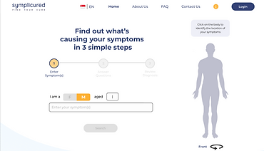

All users appreciated the presence of a body map to help accurately identify body parts but 60% of them were initially unsure how to use it as there was no explanation given.
Analysis: Users need to understand how the body map corresponds visually to their search terms.
Provide clarity to users by including onboarding instructions "Click on the body to identify the location of your symptoms" above body map.
Ensure that the body map concurrently provide users with a visual indication of specific area of body e.g. lower back that the symptoms they are searching are located at.
2. Ineffective placement of Basis of Diagnosis
Tested by Participants

Recommendation for Improvement

40% of users did not notice the 'Basis of Diagnosis' when viewing the results page as this section could only be accessed via a mouse hover.
Analysis: The hover-over function limits the usability of the website for instead of providing users with quick access to key information, there is a chance that users might miss key information if they are unaware of this function within the website.
Remove the hover-over function completely and shift the ‘Basis of Diagnosis’ section to the overview tab so that users have clear and direct access to the information
5. The Final Design
We took the feedback gathered from the usability tests and iterated the design for our final prototype.

Retrospective
Key Takeaways
Finding the sweet spot between the business, technical and user needs.
Unlike previous unsolicited UX redesign projects, this project holds more significance to me because it is a pro bono assignment for an actual client in the real world, with real business impact.
Throughout the 3 weeks of the design process, I find my team and I constantly asking ourselves and our client the same questions,"What is this feature doing? Does it support user needs? Do we have the technology capabilities to pull this through? If not, what other solutions can we come up with that fulfil all these aspects?"
On retrospect, this project taught me that principled compromises are inevitable and can help ensure success rather than undercut it. Ultimately, to be a successful designer I need to understand every stakeholder's needs and wants and craft design solutions that lie within that "sweet spot" where everything overlaps.

Next Steps
UX is always an iterative process. Moving forward, here are a few ideas that I think Symplicured can explore:
-
Responsive Mobile Site - Most users mentioned that they search via mobile hence we should definitely explore developing a mobile app/making the website mobile responsive.
-
Improving Accessibility Features - When asked who participants will recommend the website to, many mentioned the elderly. Currently, adjustable font sizes has been implemented. Next up, Symplicured can consider other accessibility features such as voice search or even text to voice.
.png)

